introduction
latticeExtra is an R package (i.e. a package for the R statistical computing environment), providing functions for generating statistical graphics. It extends the Lattice framework (lattice package), which is an implementation of Trellis graphics in R.
Many of the functions and datasets in latticeExtra are described in Deepayan Sarkar's book, Lattice: Multivariate Data Visualization with R. The book web site also includes figures and code.
This site serves as a reference for the R functions and datasets in the package. The help pages for all functions are also available as a PDF document -- the "Reference manual" -- from any CRAN mirror (see link below).
The package is maintained by Deepayan Sarkar and Felix Andrews.
For more information, see
index
| ancestry | Modal ancestry by County according to US 2000 Census |
| as.layer | Overlay panels of Trellis plots on same or different scales |
| biocAccess | Hourly access attempts to Bioconductor website |
| combineLimits | Combine axis limits across margins |
| c.trellis | Merge trellis objects, using same or different scales |
| custom.theme | Create a lattice theme based on specified colors |
| dendrogramGrob | Create a Grob Representing a Dendrogram |
| doubleYScale | Draw two plot series with different y scales |
| EastAuClimate | Climate of the East Coast of Australia |
| ecdfplot | Trellis Displays of Empirical CDF |
| ggplot2like | A ggplot2-like theme for Lattice |
| gvhd10 | Flow cytometry data from five samples from a patient |
| horizonplot | Plot many time series in parallel |
| layer | Add layers to a lattice plot, optionally using a new data source |
| mapplot | Trellis displays on Maps a.k.a. Choropleth maps |
| marginal.plot | Display marginal distributions |
| panel.2dsmoother | Plot a smooth approximation of z over x and y. |
| panel.3dmisc | Miscellanous panel utilities for three dimensional Trellis Displays |
| panel.ablineq | Draw a line with a label, by default its equation |
| panel.ellipse | Lattice panel function to fit and draw a confidence ellipsoid from bivariate data. |
| panel.key | Draw a simple key inside a panel of a lattice plot. |
| panel.levelplot.points | Panel functions for level-coded irregular points |
| panel.quantile | Plot a quantile regression line with standard error bounds. |
| panel.scaleArrow | Draw a scale bar as an arrow, labelled with its length in plot units. |
| panel.smoother | Plot a smoothing line with standard error bounds. |
| panel.tskernel | Calculate and plot smoothed time series. |
| panel.xblocks | Plot contiguous blocks along x axis. |
| panel.xyarea | Plot series as filled polygons. |
| postdoc | Reasons for Taking First Postdoctoral Appointment |
| resizePanels | Resize panels to match data scales |
| rootogram | Trellis Displays of Tukey's Hanging Rootograms |
| scale.components | Custom lattice axis scales |
| SeatacWeather | Daily Rainfall and Temperature at the Seattle-Tacoma Airport |
| segplot | Plot segments using the Trellis framework |
| style example | This is a sample plot to demonstrate different graphical settings (themes). |
| theEconomist.theme | Generate plots with style like The Economist. |
| tileplot | Plot a spatial mosaic from irregular 2D points |
| USAge | US national population estimates |
| USCancerRates | Rate of Death Due to Cancer in US Counties |
| useOuterStrips | Put Strips on the Boundary of a Lattice Display |
| xyplot.stl | Display stl fits with Lattice |
general statistical plots
rootogram
One example:
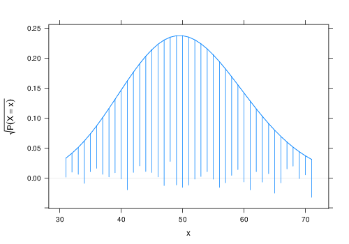
rootogram(~x, dfun = function(x) dpois(x, lambda = 50))
segplot
One example:
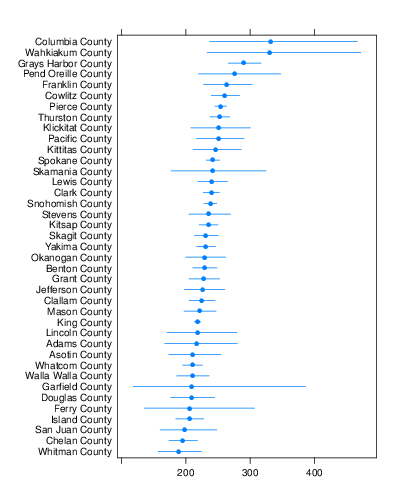
segplot(reorder(factor(county), rate.male) ~ LCL95.male +
    UCL95.male, data = subset(USCancerRates, state ==
    "Washington"), draw.bands = FALSE, centers = rate.male)
ecdfplot
One example:
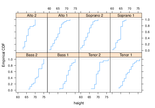
ecdfplot(~height | voice.part, data = singer)
marginal.plot
One example:
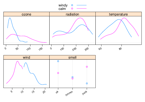
marginal.plot(enviro[, 1:5], data = enviro, groups = is.windy,
    auto.key = list(lines = TRUE))
functions of one variable
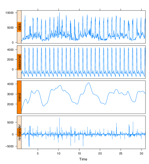
xyplot.stl
One example:
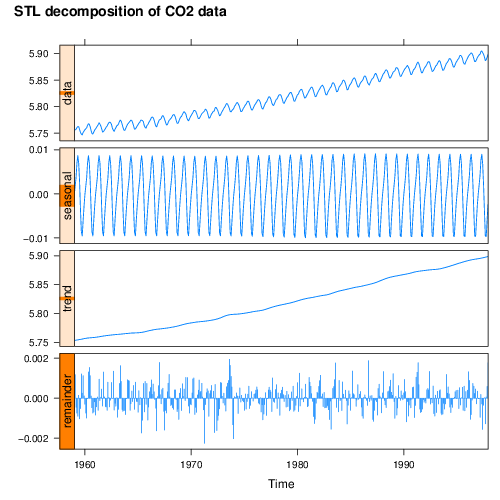
xyplot(stl(log(co2), s.window = 21), main = "STL decomposition of CO2 data")
panel.smoother
One example:
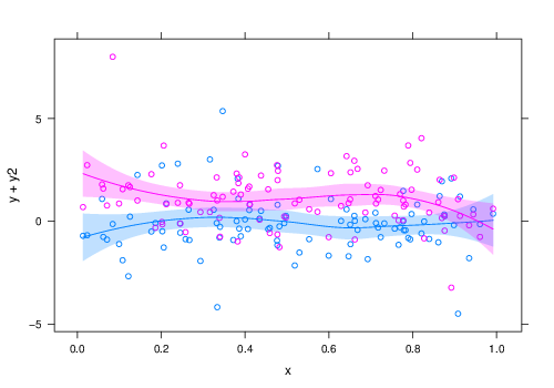
xyplot(y + y2 ~ x, xy) + glayer(panel.smoother(...))
panel.quantile
One example:
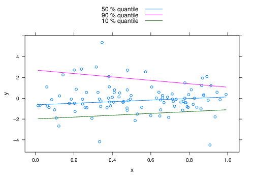
update(xyplot(y ~ x, xy) + layer(panel.quantile(x,
    y, tau = c(0.5, 0.9, 0.1), superpose = TRUE)),
    auto.key = list(text = paste(c(50, 90, 10), "% quantile"),
        points = FALSE, lines = TRUE))
panel.xblocks
One example:
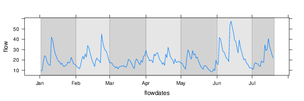
xyplot(flow ~ flowdates, type = "l") + layer_(panel.xblocks(x,
    months, col = c("lightgray", "#e6e6e6"), border = "darkgray"))
panel.xyarea
One example:
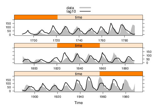
xyplot(ts.union(data = sunspot.year, lag10 = lag(sunspot.year,
    10)), aspect = "xy", cut = list(n = 3, overlap = 0),
    superpose = TRUE, panel = panel.superpose, panel.groups = function(...,
        group.number) {
        if (group.number ==....
panel.tskernel
One example:
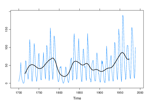
xyplot(sunspot.year) + layer(panel.tskernel(x, y,
    width = 20, c = 3, col = 1, lwd = 2))
horizonplot
One example:
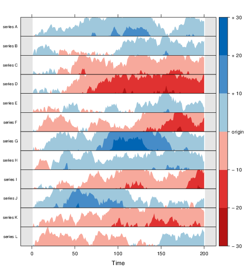
horizonplot(dat, horizonscale = 10, colorkey = TRUE,
    layout = c(1, 12), strip.left = FALSE, ylab = list(rev(colnames(dat)),
        rot = 0, cex = 0.7)) + layer_(panel.fill(col = "gray90"),
    panel.xblocks(..., col = "white"))
functions of two variables
mapplot
One example:
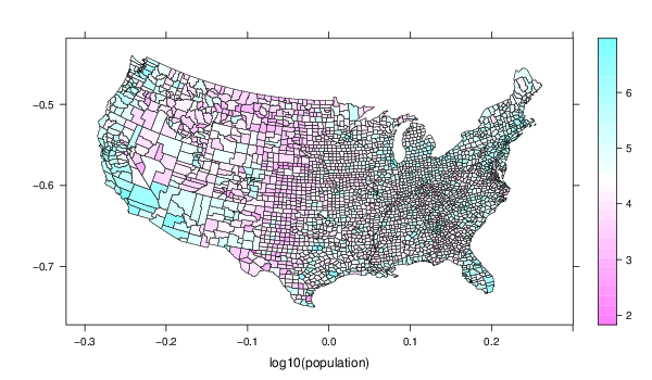
mapplot(county ~ log10(population), ancestry, map = county.map,
    colramp = NULL)
tileplot
One example:
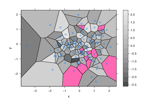
tileplot(z ~ x * y, xyz, border = "black", col.regions = grey.colors(100),
    pch = ifelse(is.na(xyz$z), 4, 21), panel = function(...) {
        panel.fill("hotpink")
        panel.voronoi(...)
    })
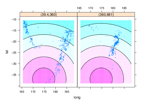
panel.levelplot.points
One example:
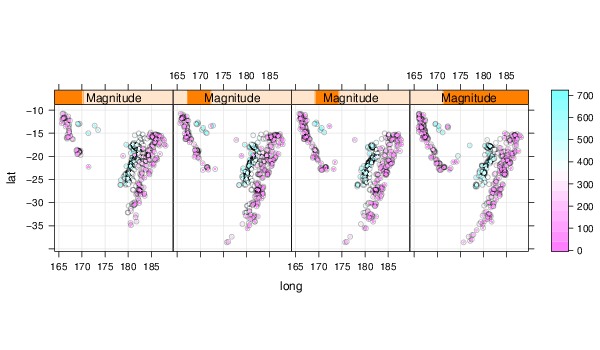
levelplot(depth ~ long + lat | Magnitude, data = quakes.ordered,
    panel = panel.levelplot.points, type = c("p",
        "g"), aspect = "iso", prepanel = prepanel.default.xyplot)
panel.2dsmoother
One example:
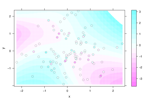
levelplot(z ~ x * y, xyz, panel = panel.levelplot.points,
    cex = 1.2) + layer_(panel.2dsmoother(..., n = 200))
panel.ellipse
One example:
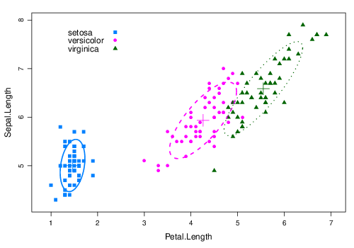
xyplot(Sepal.Length ~ Petal.Length, groups = Species,
    data = iris, scales = "free", par.settings = list(superpose.symbol = list(pch = c(15:17)),
        superpose.line = list(lwd = 2, lty = 1:3)),
    panel = function(x, y, ...) {
        pane....
dendrogramGrob
One example:
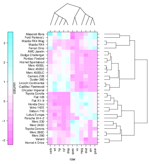
levelplot(x[row.ord, col.ord], aspect = "fill", scales = list(x = list(rot = 90)),
    colorkey = list(space = "left"), legend = list(right = list(fun = dendrogramGrob,
        args = list(x = dd.col, ord = col.ord, side = "right",
            si....
utilities
useOuterStrips
One example:
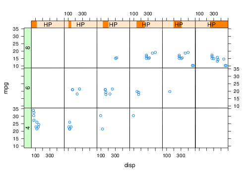
xyplot(mpg ~ disp | HP + factor(cyl), mtcars, layout = dimx,
    par.strip.text = list(lines = 0.5), strip = new.strip,
    strip.left = new.strip.left, par.settings = par.settings)
resizePanels
One example:
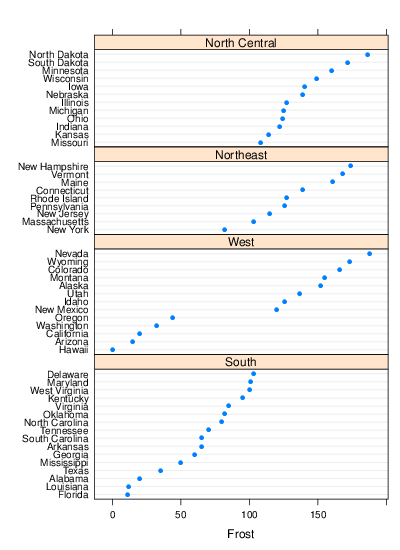
dotplot(state.name ~ Frost | reorder(state.region,
    Frost), data = state, layout = c(1, 4), scales = list(y = list(relation = "free")),
    par.settings = list(layout.heights = list(panel = h),
        layout.widths = list(panel = w)))
combineLimits
One example:
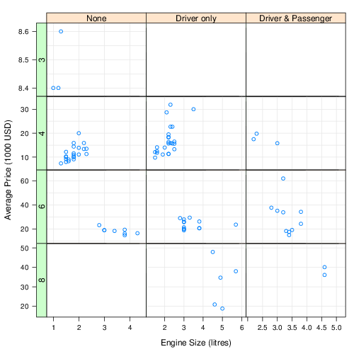
xyplot(Price ~ EngineSize | reorder(AirBags, Price) +
    Cylinders, data = Cars93, subset = Cylinders !=
    "rotary" & Cylinders != "5", scales = list(relation = "free",
    y = list(log = FALSE, tick.number = 3, rot = 0)),
    xlab = "Engine S....
scale.components
One example:
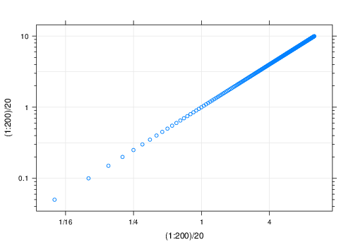
xyplot((1:200)/20 ~ (1:200)/20, type = c("p", "g"),
    scales = list(x = list(log = 2), y = list(log = 10)),
    xscale.components = xscale.components.fractions,
    yscale.components = yscale.components.log10ticks)
panel.ablineq
One example:
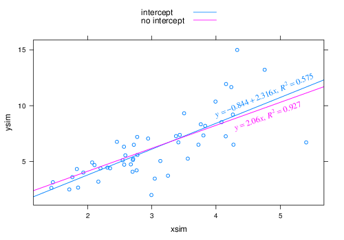
update(xyplot(ysim ~ xsim) + layer(panel.ablineq(lm(y ~
    x), r.sq = TRUE, rot = TRUE, at = 0.8, pos = 3),
    style = 1) + layer(panel.ablineq(lm(y ~ x + 0),
    r.sq = TRUE, rot = TRUE, at = 0.8, pos = 1),
    style = 2), auto.key = list(text....
panel.scaleArrow
One example:
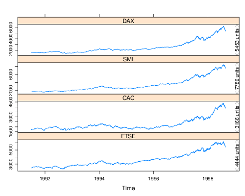
xyplot(EuStockMarkets) + layer(panel.scaleArrow(x = 0.99,
    append = " units", col = "grey", srt = 90, cex = 0.8))
panel.3dmisc
One example:
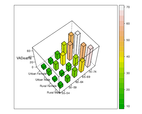
cloud(VADeaths, panel.3d.cloud = panel.3dbars, xbase = 0.4,
    ybase = 0.4, zlim = c(0, max(VADeaths)), scales = list(arrows = FALSE,
        just = "right"), xlab = NULL, ylab = NULL,
    col.facet = level.colors(VADeaths, at = do.breaks(range(....
panel.key
One example:
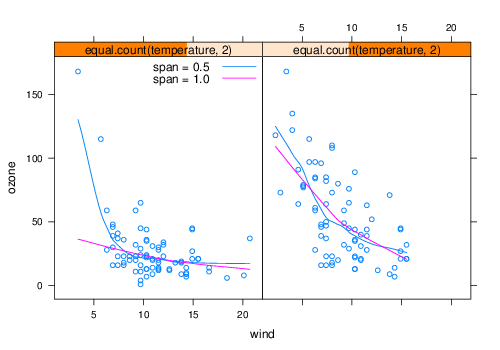
xyplot(ozone ~ wind | equal.count(temperature, 2),
    data = environmental) + layer(panel.loess(x,
    y, span = 0.5), style = 1) + layer(panel.loess(x,
    y, span = 1), style = 2) + layer(panel.key(c("span = 0.5",
    "span = 1.0"), corner = c....
extended trellis framework
layer
One example:
qua + layer_(panel.contourplot(x = gridlon, y = gridlat,
    z = dist, contour = TRUE, subscripts = TRUE),
    data = newdat)
as.layer
One example:
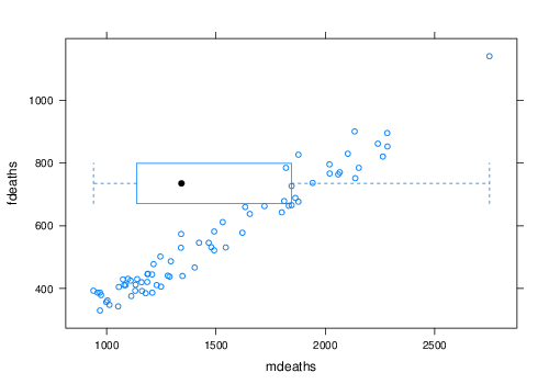
xyplot(fdeaths ~ mdeaths) + as.layer(bwplot(~mdeaths,
    box.ratio = 0.2), y.same = FALSE)
doubleYScale
One example:
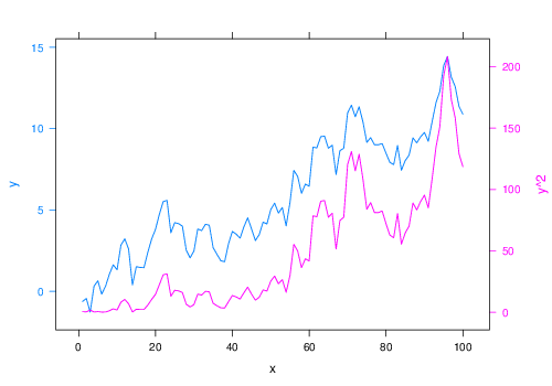
doubleYScale(obj1 = obj1, obj2 = obj2, add.ylab2 = TRUE)
c.trellis
One example:
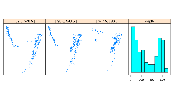
update(c(xyplot(lat ~ long | equal.count(depth, 3),
    quakes, aspect = "iso", pch = ".", cex = 2, xlab = NULL,
    ylab = NULL), histogram(quakes$depth), x.same = FALSE,
    y.same = FALSE, layout = c(4, 1)), scales = list(at = list(NULL,
    N....
styles
style example
One example:
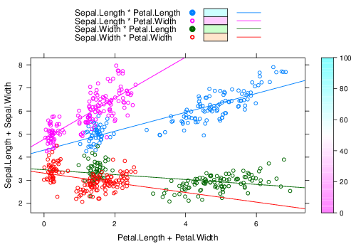
xyplot(Sepal.Length + Sepal.Width ~ Petal.Length +
    Petal.Width, iris, type = c("p", "r"), jitter.x = TRUE,
    jitter.y = TRUE, factor = 5, auto.key = list(lines = TRUE,
        rectangles = TRUE), legend = list(right = list(fun = "draw.color....
custom.theme
One example:
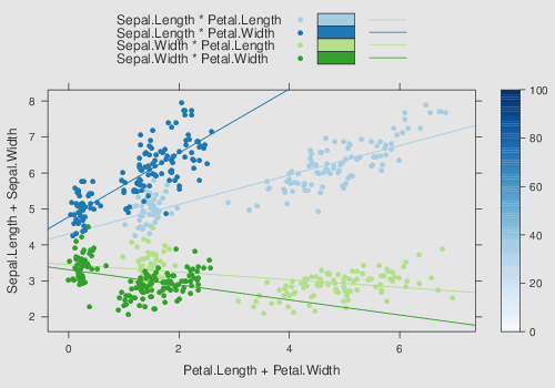
xyplot(Sepal.Length + Sepal.Width ~ Petal.Length +
    Petal.Width, iris, type = c("p", "r"), jitter.x = TRUE,
    jitter.y = TRUE, factor = 5, auto.key = list(lines = TRUE,
        rectangles = TRUE), legend = list(right = list(fun = "draw.color....
ggplot2like
One example:
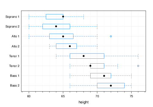
bwplot(voice.part ~ height, data = singer)
theEconomist.theme
One example:
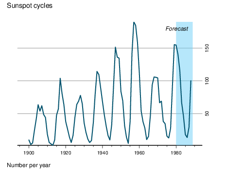
trellis.last.object() + layer_(panel.xblocks(x, x >=
    1980, col = "#6CCFF6", alpha = 0.5)) + layer(panel.text(1988,
    180, "Forecast", font = 3, pos = 2))
data
USAge
One example:
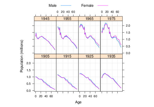
xyplot(Population ~ Age | factor(Year), USAge.df,
    groups = Sex, type = c("l", "g"), auto.key = list(points = FALSE,
        lines = TRUE, columns = 2), aspect = "xy",
    ylab = "Population (millions)", subset = Year %in%
        seq(1905, 19....
USCancerRates
One example:
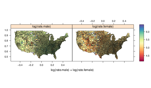
mapplot(rownames(USCancerRates) ~ log(rate.male) +
    log(rate.female), data = USCancerRates, map = map("county",
    plot = FALSE, fill = TRUE, projection = "mercator"))
postdoc
One example:
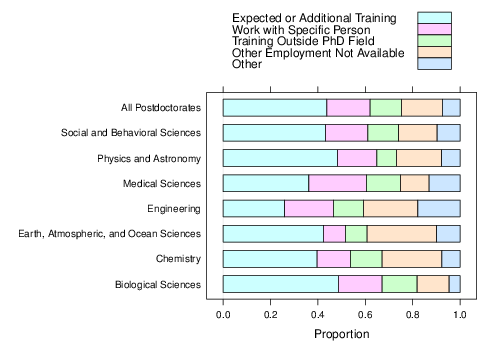
barchart(prop.table(postdoc, margin = 1), auto.key = TRUE,
    xlab = "Proportion")
biocAccess
One example:
xyplot(stl(ts(biocAccess$counts[1:(24 * 30)], frequency = 24),
    "periodic"))
gvhd10
One example:
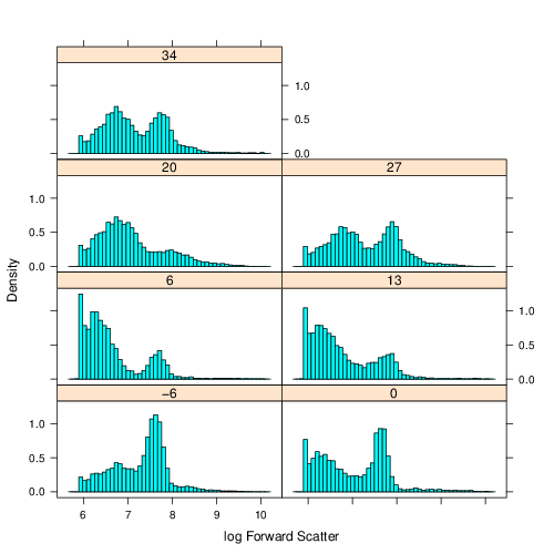
histogram(~log2(FSC.H) | Days, gvhd10, xlab = "log Forward Scatter",
    type = "density", nint = 50, layout = c(2, 4))
SeatacWeather
One example:
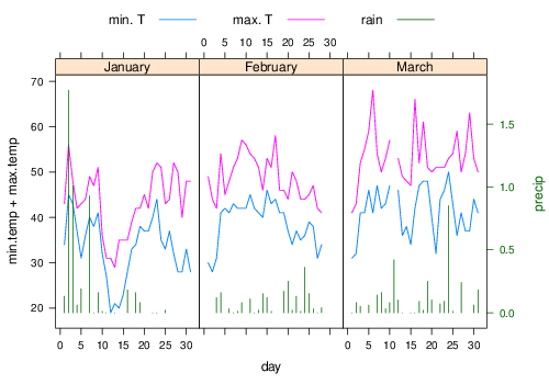
doubleYScale(obj1 = temp, obj2 = rain, style1 = 0,
    style2 = 3, add.ylab2 = TRUE, text = c("min. T",
        "max. T", "rain"), columns = 3)
EastAuClimate
One example:
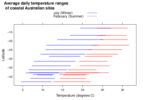
segplot(Latitude ~ WinterMinTemp + SummerMaxTemp,
    EastAuClimate, main = "Average daily temperature ranges n of coastal Australian sites",
    ylab = "Latitude", xlab = "Temperature (degrees C)",
    par.settings = simpleTheme(lwd = 3, alpha ....